Finally!
The transition that we have worked on for over nine months, is out in the open. Now we are entering the next stage. Today, Deepeei film productions is transformed into: DUTCH PICTURE INDUSTRY. It is big step and we will have to get used to it ourselves also.
You might wonder why, this decision to change the name and create a new visual identity?
Our experience tells us, that WE people have a deformation in our brain and we are unable in processing four ‘e’s in one word. For most of us it’s too difficult to handle. Our name was so tricky, so Deepeei has been misrepresented in the press, many times. Even our national press agency, the ANP had trouble in writing Deepeei right. After ten years messing around with ‘e’s, and pronouncing our name in the right way, we thought it was time to change.
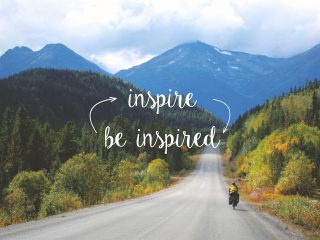
It’s time for progress. If you see the name written, you might notice that in fact it is still the same name. (DPI) So the change is less radical then it seems at first sight. And our mission to INSPIRE and MOTIVATE is still, running through everything we give birth to.
Stories and the WHY
This wonderful world is full of stories. It is our challenge to inspire our viewers with compelling, and unique story lines. But why should a client choose for DUTCH PICTURE INDUSTRY. What is our WHY? In search for our WHY together with conceptual designer Mark Kuiper we discussed this in every little step. If you search the Internet you directly see that the first link is of Simon Sinek’s book, ‘It all start with a Why’ and so do we. Everything that we touch comes from our core, from what we believe in, from the inside of every fibre. We love what we do and that is why we are good in what we do.
DUTCH PICTURE INDUSTRY is curious about that one eccentric dash.
Designers food
The new corporate design, made by Mark, shows how the mission, philosophy and values shape Dutch Picture Industry. We are driven by a philosophy centred on innovation and encapsulating in our mission statement “to inspire and motivate”. In the development of the new corporate identity was a stencilled letter an important source of inspiration. Stencils are characteristic and exude adventure, features we identify. The diversity of colours strengthens the ties with the unique images and even more importantly nature.
We are VERY enthusiastic about our new name and brand identity. Well, what do you think?